I ran across this essay recently on the role of design standards for scientific data visualization. The author, Jure Triglav, draws his inspiration from the creation and continued use of the NYCTA Graphics Standards, which were instituted in the late 1960s to unify the signage for the New York City subway system.
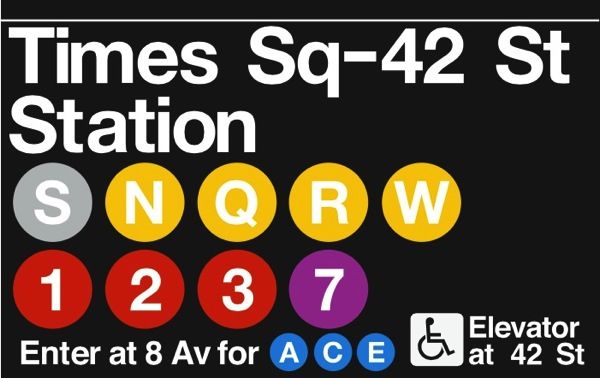
Image: A Case for Spaceships (Jure Triglav)
As the author puts it, the Graphics Standards Manual is "a timeless example of great design elegantly solving a real problem." Thanks to the unified iconography, a traveler on the New York subway knows exactly what to look for to navigate the subway system, no matter which station they may be in. And the iconography is beautiful, too.
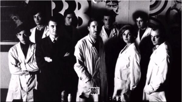
Unimark, the design company that designed the Graphics Standards.
Aren't they a hip, mod looking group? And I'm jealous of those lab coats.
Image: A Case for Spaceships (Jure Triglav)
What works to clarify subway travel will work to clarify the morass of graphs and charts that pass for scientific visualization, Triglav argues. And we should start with the work of the Joint Committee on Standards for Graphical Presentation, a group of statisticians, engineers, scientists, and mathematicians who first adopted a set of standards in 1914, revised in 1936, 1938, and 1960.
I agree with him -- mostly.
The 1914 and 1938 reports are online; if you have read William Cleveland's The Elements of Graphing Data or Darrell Huff's How to Lie with Statistics, you will have seen most of the guidelines before, although I thought the 1938 report in particular was especially clear and eloquent about its guiding principles. It should be noted that the 1938 document emphasizes that the guidelines are only that -- they are not intended as a set of rigid rules.
The committee believes that effective presentation calls for flexibility of treatment rather than for standardization, that each chart should be individually planned with due reference to the special characteristics of the data and the particular use to which the chart is to be put.
And in fact, while Cleveland and Huff definitely both echo the Joint Committee's recommendations, they do disagree in places, for example on whether or not a graph of quantities should always include zero. It depends on the use of the chart: exploration vs. presentation. The NYCMTA Graphics Standards address a specific situation; in this case, fixed, rigid standards are appropriate. When we are discussing all of scientific and engineering visualization, the best we can hope for are a set of guiding principles. What the Joint Committee -- and Cleveland, Huff, Tufte, and others -- were really trying to do is to set the standards for good taste.
People think of taste as a subjective thing, and when it comes to food, fashion, film, art, or literature, that's true. One person's great read is another person's awful junk. I avoid accusing anyone of having "bad taste" when it comes to the subjects above. But in the problem solving disciplines - computer science (coding in particular), engineering, architecture, ergonomics, math, science, and so on - I think that bad taste is a real thing. A real harmful thing. We already use terms like "elegant" or "ugly" when we describe mathematical proofs, or code, or other solutions to various problems. Some "solutions" can be so ugly that they are in fact counterproductive. That's bad taste.
Let's go back to our mass transit example with this critique from user experience designer Sarah Doody on the badly designed ticket machines (that were in place at the time of her visit) for BART, San Francisco's subway/light-rail system. And in her criticism, she didn't even get to what I'd noticed was the biggest problem for new users: where the purchased ticket came out was nowhere near either the screen or the slot where you entered money; it came out well below eye level (in the red region of the left image, below). Compare that with the MTA's ticket machines, where the ticket dispensers are right next to the money insertion slot:
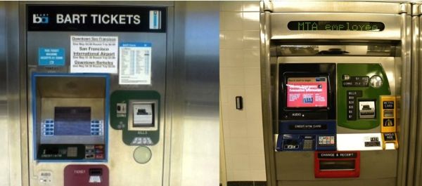
Left image: Nile Guide; Right image: Rev Stan, Flickr
To my mind, the old BART ticket machine is the equivalent of spaghetti code: technically, it gets the job done, but it's ugly, incomprehensible, and as Ms. Doody points out, many of the choices that went into its creation are just plain wrong. Its design, such as it was, could be fairly called bad taste. Some people see it the other way:
What we are trying to point out is: design is not always just a matter of taste. With enough design principles in mind (such as least astonishment, Liskov substitution, and a few others) you can actually say some design decisions are wrong (and maybe even some day some other design decisions are right). There are very few general principals of software system design, so you really don’t want to ignore the few you have.
I would argue that design is a matter of taste. It's just that, in the problem-solving disciplines, taste is not entirely subjective.